Smarter Root Cause Analysis: Determining Causality from your ITSI KPIs
Platform Greg Ainslie-MalikRoot cause analysis can be a difficult challenge when you are troubleshooting complex IT systems. In this blog, we are going to take you through how you can perform root cause analysis on your IT Service Intelligence (ITSI) episodes using machine learning, or more specifically causal inference.
The approach shown here is included in the Smart ITSI Insights app for Splunk, with this blog largely detailing how to use the ITSI Episode Analysis dashboard. Before we get going with the content it is worth mentioning that the capabilities shown here are dependent on having version 3.4 of the Deep Learning Toolkit installed and operational.
Episode Analysis
To begin with we’re going to take a look at all of our episodes in ITSI using the ITSI Episode Analysis dashboard in the app. We can choose to view these by criticality, or over a specific time window.
A few basic reports are displayed about the episodes, with trend lines by service over time and a breakdown of the affected services as well so you can see at a glance if there is a particular service that appears problematic. Beneath these reports is a table listing all of the episodes, detailing the time it was raised, the title of the episode, the service that is affected and the severity of the episode.

Causal Analysis
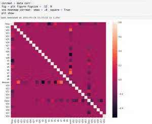
If you click on any of the episodes in the table some dashboard panels will start to populate below. These dashboards present the causal relationships between the KPIs that the affected service relies on – showing which KPI are affecting each other.
The calculations are performed over a 4-hour window immediately prior to the episode being generated, so we can quickly assess what these relationships look like ahead of an episode being raised.
The table displays all of the KPIs that appear to have a direct impact on the health score of the affected service – in other words, these are the likely culprits behind the episode being raised. Beneath the table, you will also be able to see a chart that highlights all of the relationships between the KPIs for the affected service. You can hover over this chart to see the relationships for a given KPI.

Root Cause Analysis
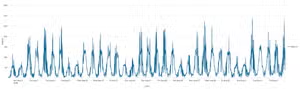
If you click on the table that shows the service linked to the root_cause_kpis you will be taken to the ITSI deep dive dashboard, with a swim lane for each KPI in the table. The data on display covers the window 45 minutes prior to the episode and 15 minutes after the episode being generated – so an hour around the episode.

In this example, you can see that the likely cause of the episode being generated is that the disk space used was running very high.
Hopefully, you have seen in this blog how you can easily determine root cause from your episodes using machine learning and will be able to more easily identify the source of your problems across your environment.
Happy Splunking!
Related Articles
Detecting Credit Card Fraud Using SMLE
Introducing the New Workload Dashboard: Enhanced Visibility, Faster Troubleshooting, and Deeper Insights